Redefining Graphic Design for Accounting Firms
In the accounting world, graphic design’s influence often goes overlooked. Numbers may dominate the minds of CPAs, but design shapes perceptions, builds trust and drives engagement from clients and prospects. Good design brings functionality that goes beyond mere aesthetics. In fact, a survey from Enginess found that 46% of respondents judged a website’s credibility based on overall design.

Accounting firms historically opt for conventional designs—serif fonts, corporate color schemes, understated logos. But contemporary, approachable branding is what truly gains ground with prospective clients.
It’s no secret that accountants tend to hesitate to break the norm, and why shouldn’t they? Why break from tradition? In short, pushing the envelope not only sets firms apart but also resonates with modern clients. Let’s explore how.
Graphic Design in Accounting: Where We Are Now
Typically, accounting firm branding evokes images of serif fonts painted in blues and grays, symbolizing corporate reliability. Though these choices convey trust and professionalism, they can cause firms to fade into a sea of similarity. The challenge? Differentiating oneself in a crowded marketplace.
Modern Design vs. Conventional Comforts
While serif fonts and darker shades have long symbolized stability and trust, sticking to this comfort zone can render a firm outdated, especially in our digital-first world. Many firms proport to want a “clean, modern, minimal” aesthetic, but when presented with it, apprehension often ensues. This apprehension is rooted in the fear of straying too far from industry norms.
However, statistics suggest that breaking away from the norm can have tangible benefits. According to Linearity, a unique logo can increase brand visibility by 80%. Furthermore, brands with recognizable logos are 58% more likely to perform well in the stock market. The truth is that if your firm’s logo is all serifs and dark blues, the chances of it standing out are slim.
Moreover, aiming to cater to diverse clients can often result in universally “safe” but lackluster designs. Yet, a study by FinancesOnline reveals that 42% of consumers believe a logo effectively conveys a company’s personality. People want to work with firms that they feel personally connected to, and fostering a unique brand identity is an effective way to forge these connections.
The Path to Timeless, Modern Design
So, what design tenants should accounting firms be looking to? The key words here are “timeless” and “modern.” Your firm should appear contemporary and stay in line with current trends while still maintaining the trust and consistency that timeless design exudes. If your design is too unorthodox, your firm may come across as gimmicky and unprofessional. But if your design looks the same as everyone else’s, you’ll drown in a sea of undifferentiated firms.
The path to timeless, modern design often begins with a rebrand. As trends shift and new competitors emerge, reevaluating your visual identity through a brand refresh helps realign the firm with current market expectations. This evolution often requires leaving behind design traditions that no longer resonate in today’s landscape.
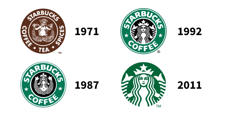
It’s important to stress that rebranding does not mean stepping away from your core brand identity. A good rebrand will maintain certain visual elements so that the overall essence of the design persists. For example, take a look at how the Starbucks logo has evolved over the years.
The 1987 redesign is by far the most dramatic, but it still retains a familiar layout and iconography. In 1992, the branding undergoes a few minor tweaks to modernize its look. Finally, 2011’s logo completely eliminates the circular border and text. The iconic shade of Starbucks green and stylized siren icon have become so recognizable that they alone are able to carry the brand’s core identity.
Redesigning your firm’s branding should strike a balance between making loyal clients feel at home while attracting new prospects who align with your modernized image. Your logo doesn’t have to leap from 1971 to 2011 all at once (and in fact, it shouldn’t), but there’s nothing to fear about taking the step from 1992 to 2011.
A Step-by-Step Rebranding Framework
- Audit existing materials. Identify strengths and weaknesses to inform your starting point.
- Partner with branding experts (such as those at The Growth Partnership) to gain industry insights and creative solutions.
- Research your target audience’s preferences to guide design choices.
- Balance tradition and innovation. Retain heritage elements while incorporating modern updates.
- Test across platforms and tweak as needed for adaptability.
- Gather diverse feedback through focus groups and surveys to make data-driven decisions.
- Roll out strategically, prioritizing high-impact touchpoints like your website. Keep stakeholders looped in.
- Post-launch, analyze performance indicators to refine efforts and optimize impact.
Conclusion: Renewing Design While Retaining Identity
Venturing into innovative design in the traditionally conservative accounting sector may seem daunting. Still, the rewards—like market differentiation, attracting a tech-savvy clientele, enhancing user experience and boosting team morale—can be substantial. Innovating today also future-proofs your brand.
So, are you ready to take your accounting firm’s graphic design to the next level? If you’re looking for tailored marketing solutions to help you stay ahead of trends and drive success, contact us today. Let’s work together to create a brand that not only looks good but also aligns perfectly with your firm’s values and objectives.